PROCESS: Spring Surprise illustration

This post is all about the process of creating “Spring Surprise”, an illustration I completed for my portfolio. Enjoy!
PURPOSE of this PROJECT
This illustration would hopefully be a portfolio piece. An illustration with warm, light spring time colors and a spring theme seemed like the best addition to my existing body of work.
At the time of doing this drawing, I was 3 weeks away from having a new baby! Since it’s impossible to predict how those first weeks will go, I wanted to have something that would seem timely when I was ready to get rolling again in early April.
We live in the age of social media* and it’s important to WORK AHEAD. I started The Elves 2 weeks before Christmas. By the time I got my character designs and story skeleton worked out, it was already New Year’s! I have no regrets about the timing of that project but I wanted my next project to be something I could release on social that felt of the moment. Now I’ve got an Easter illustration all queued up that I’m quite proud of.
After mulling this compilation over I noticed the following:
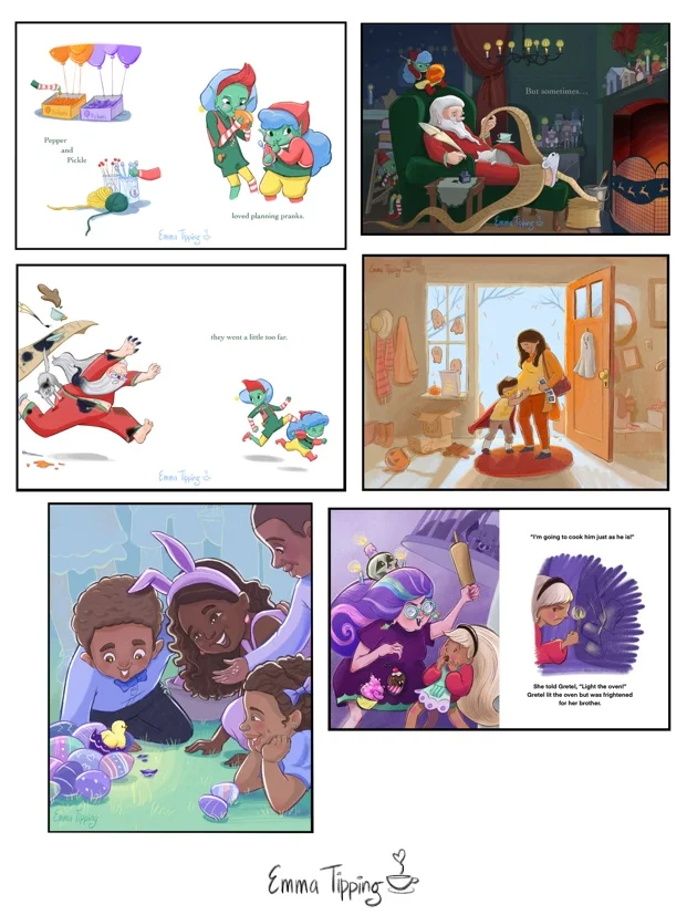
All of my pieces feature an adult and child.
In most of the pieces the characters are standing upright.
2 out of 3 of the full bleed pieces (full color reaching to edge of pages) are cold month color palettes (winter and spring).
All of these illustrations are zoomed out on a scene. Gretel and the Witch has the biggest close up and even that is still fairly zoomed out.
None of the illustrations have more than 3 characters.
FIRST SKETCHES

As you can see, the Dino idea died a quick and early death. First of all, I had just spent a month on a project with developed characters and multiple images (The Elves Who Went Too Far) and wanted a faster turn around. The SCBWI Winter Conference portfolio contest deadline was fast approaching so it had to be a once and done image. I also know from hanging out with lots of kids that scientific inaccuracy when it comes to Dinosaurs is a major faux pas. Kind of like showing up to a cocktail party in your Birkenstocks and underpants. In the few minutes of visual research I did on Google images I remembered that 1) baby dinosaurs are HUGE, at least the species that I was interested in drawing; and 2) it’s been pretty well debunked that dinosaurs were NOT bright green and in fact probably had feathers.
Creating these quick thumbnail sketches is one of my favorite parts of illustrating. It’s such a free part of the process where all things are possible. For Spring Surprise, I especially loved drawing the chick’s silhouette and sweet little beak!
COLOR CONCEPTS
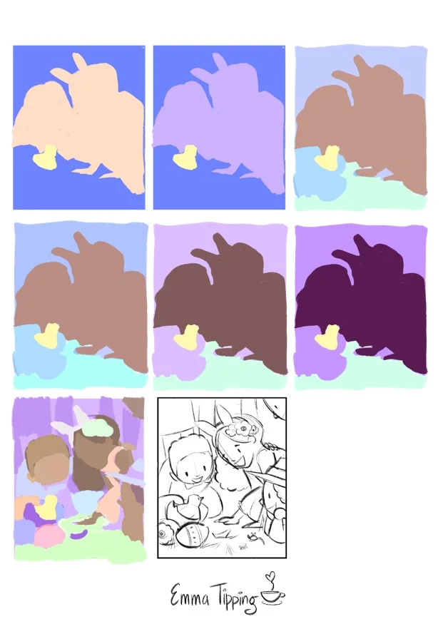

As you can see, I played with having the same color family in the foreground and background as well as using the kids as a “split” between two different colors. My goal with this concept phase was to explore the following:
How to make the chick the focal point of my illustration using color. I planned to do this by contrasting the yellow chick with an intense purple or blue violet, as well as having a stark value contrast in the same spot that I would work out in the value stage.
How to create a spring-like palette that stuck mostly to vivid, pure, pastel colors.
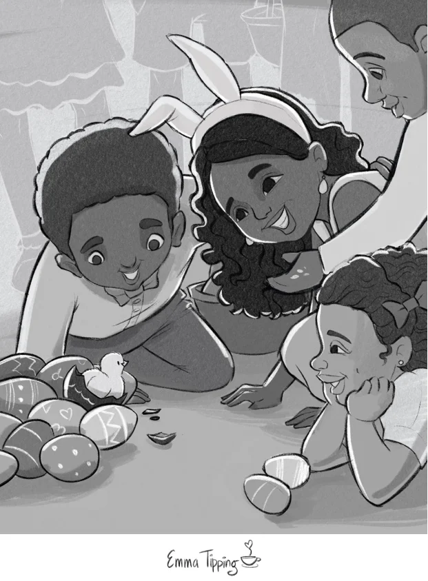
LINE

I’d like to mention that getting to this line drawing took a few drafts. I almost always share my work at the concept and drafting stage with my kids or their friends to see if I’m hitting the mark. It’s a great practice because kids don’t pretend to like things. I showed the first drawing of Spring Surprise to my 9 year-old daughter. This kid consistently gives awesome feedback, btw. She’s my target audience, she loves art and she’s very articulate. When I showed her my first draft she made a face and said, “Mom I don’t get it”. Then she pointed out that while the curly headed boy was looking good the other characters’ faces looked too old. They looked like adult heads slapped on kid bodies. Obviously that was not the look I was going for so I aged the kids down and then, presto, I got a go from the committee.

I really liked how the lighter lines in the background gave the piece a woodblock feel. It also helped keep the viewer focused on the main action in the foreground. I’m not sure if I would do disembodied legs in the background again but at the time they felt like a good device to convey a crowd while focusing on the kids in the front.
I ran this version by my editor (again, the nine year-old girl who lives with me and calls me “mom”) and she loved it!

…and it looked good! So I edited my line drawing and then my value study to include his new head pose.
Last but not least, you can see that in the line drawing above, the eyes of the girl in the middle are different from the value study. That’s because, you guessed it, I realized that she was gazing off into the great beyond as well. Finally, after that adjustment, I was ready to start adding color.
FINAL COLOR
I was so close to being done but the girl with the long hair was still catching my eye too much. I decided that the multiple value contrasts of her eye whites to irises and hair to highlight were just too eye catching. I toned both of those contrasts down and here is the end result!


And here is how it looks in my portfolio!
Spring Surprise was a lot of fun to create. I’m happy with how it looks in my portfolio and also happy to have solved a number of problems. Best of all, I’m super pumped to move onto the next piece, apply what I learned during this process, and tackle some new challenges.